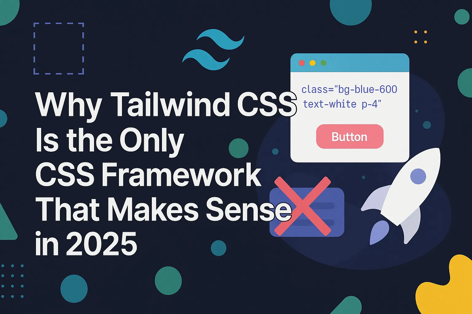
Why Tailwind CSS Is the Only CSS Framework That Makes Sense in 2025

Tailwind didn’t quietly enter the scene. It walked in, ripped the mic out of Bootstrap’s hands, and said:
“You don’t need a theme — you need control. Tailwind gives you both.”
We’re not in 2015 anymore. This is 2025, where frontend devs are sick of fighting their tools just to make a button that doesn’t scream “default theme.”
Old-school frameworks didn’t evolve, they fossilized.
Bootstrap. Foundation. Bulma.
All of them tried to be helpful, but in the end, they just gave us different flavors of the same fast food menu:
- Same buttons
- Same navbars
- Same grid
- Same damn site
Tailwind didn’t just replace them; it exposed the illusion of abstraction. It called out the lie that “you shouldn’t style in your HTML.”
No. Tailwind said:
"Let’s stop pretending CSS belongs in a separate monastery. Let’s write what we mean, where we need it."
🧠 Utility = Clarity
Let’s compare two buttons. One from the Old Testament (Bootstrap) and one forged in the fires of Tailwind.
Bootstrap:
<button class="btn btn-primary">Click Me</button>
Sure, it’s clean, but what does it do?
Where’s the size? The spacing? The hover state? You're digging into the btn class, inspecting compiled CSS, overriding it in another stylesheet like it’s 2012.
Tailwind:
<button class="px-4 py-2 bg-blue-600 text-white rounded hover:bg-blue-700">Click Me</button>
You read it, and you know what it does. It’s not just a button; it’s this button, with these styles, right here, no translation needed.
Tailwind isn’t just another tool in the box.
It is the box.
And once you've used it, going back to traditional frameworks feels like choosing dial-up internet over fiber.
Exhibit A: Bootstrap’s Bloated Corpse
Let’s be honest: Bootstrap was never beautiful.
It was convenient. It was safe. It was the comfy sweatpants of frontend development. But now?
It’s the PowerPoint template of the web — stale, bloated, and used by every intern in a rush to meet a deadline.
If you’ve seen one Bootstrap site, you’ve seen them all:
- Boxed layout? Check.
- Blue buttons? Check.
- Rounded corners that scream “default”? Double-check.
- A navbar that looks suspiciously like 5,000 other navbars? Oh, absolutely.
"Bootstrap is great… if you want your site to look like a dashboard from 2013."
Let’s compare a simple hero section, shall we?
🤕 Bootstrap Version (Mummified Layout)
<div class="container">
  <div class="row">
    <div class="col-md-6">
      <h1 class="display-4">Welcome to Our Site</h1>
      <p class="lead">We build stuff. Big stuff.</p>
      <a href="#" class="btn btn-primary">Get Started</a>
    </div>
  </div>
</div>
Cool. Now go open the Bootstrap docs, check what container, row, and btn-primary actually do, tweak a separate stylesheet to override the button color, and fight the built-in margins for 20 minutes. Enjoy your productivity crisis.
🔥 Tailwind Version (Alive, Flexible, Free)
<section class="bg-gray-100 py-20">
  <div class="max-w-5xl mx-auto px-6 text-center">
    <h1 class="text-4xl font-bold mb-4">Welcome to Our Site</h1>
    <p class="text-lg text-gray-600 mb-6">We build stuff. Big stuff.</p>
    <a href="#" class="inline-block bg-blue-600 text-white px-6 py-3 rounded hover:bg-blue-700">
      Get Started
    </a>
  </div>
</section>
Readable. Composable. Instantly tweakable.
Want to make the text larger? Add text-5xl.
Change background color? Replace bg-gray-100.
No context-switching. No overrides. No bloat.
The Bootstrap version looks like it was designed by committee.
The Tailwind version? That’s yours. Fully.
No extra layers, no guesswork, just code that looks like what it does.
So yeah, Bootstrap still has its fans.
But so does Internet Explorer.
Utility-First: Why Tailwind Wins
Here’s the truth that hurts:
“Naming classes after intentions doesn’t make your CSS semantic — it makes it vague.”
You call it .hero-header-large-primary because you want to be “semantic.” I call it what it is: a brittle guess at design intent wrapped in three layers of abstraction.
It’s like naming your toothbrush “MouthCleanerAlpha”—sure, it’s technically descriptive. But why?
Tailwind doesn’t pretend. It doesn’t wrap styling in a fake philosophical hug. It gives you tools, not templates. And in 2025, the best tools are:
- Composable
- Scalable
- Human-readable
🧩 Utility Classes = Design Tokens, Not Trash
Tailwind’s utility classes map directly to your design system (spacing, colors, typography), all encoded as tokens you control in tailwind.config.js.
Need brand-specific spacing? Set it once:
theme: {
  extend: {
    spacing: {
      'brand-padding': '3.25rem',
    },
  },
}
Now in HTML:
<div class="p-brand-padding">...</div>
You don’t get that level of power with .card--big-card--blue--shadowed.
🌗 Variants + Dark Mode? It’s a Built-In Superpower
Dark mode isn’t a plugin. It’s a first-class citizen in Tailwind.
<div class="bg-white text-gray-900 dark:bg-gray-900 dark:text-gray-100 p-6 rounded-lg">
  <h2 class="text-xl font-semibold">Dashboard</h2>
</div>
Want responsive? Add md:.
Want hover? Add hover:.
Want conditional states? Add group-hover:.
No new classes. No overrides. No drama.
🧱 Sample Component: A Reusable Card, Styled with Tailwind
Let’s build a clean, modern card component with dark mode, responsiveness, and theme-based spacing:
<div class="bg-white dark:bg-gray-800 p-6 rounded-lg shadow-md max-w-md mx-auto">
  <h2 class="text-2xl font-bold text-gray-800 dark:text-gray-100 mb-2">
    Tailwind Is The Truth
  </h2>
  <p class="text-gray-600 dark:text-gray-300">
    A utility-first CSS framework for people who ship faster than they complain.
  </p>
</div>
No external CSS. No class name debates.
Just pure, functioning design. Clean, lean, and deadly.
So no, utility classes aren’t “ugly.”
They’re honest.
And honest code scales better than abstract fantasy.
Semantic CSS was a noble idea. But like knights and floppy disks—it belongs in the museum.
Real-World Dev Speed: Build Faster, Debug Less
Tailwind’s biggest flex isn’t its syntax.
It’s speed.
Speed to build. Speed to change. Speed to fix.
No context switching. No hunting through a jungle of .scss files just to tweak a padding. No “Is it btn--primary or button__main?” existential crisis.
With Tailwind, you write the markup and the design at once, right where you’re already thinking about structure and behavior.
“Tailwind is for developers who actually ship.”
Not theorize. Not tinker. Not endlessly refactor a style guide that never gets used.
🧠 No More Class-Naming Hunger Games
You don’t spend half your day naming a component like:
.card-container-content--variant-a-alt
With Tailwind, you write exactly what it is:
<div class="bg-white shadow rounded-lg p-6">...</div>
And you move on. Because you have a product to build. Not a philosophy paper to write.
💻 UI in One File: From Idea to Working Component
Let’s build a fully-styled card UI right inside your HTML, no extra CSS file, no custom class naming conventions:
<div class="max-w-sm bg-white dark:bg-gray-900 text-gray-800 dark:text-gray-100 p-6 rounded-xl shadow-md">
  <h3 class="text-xl font-semibold mb-2">Tailwind FTW</h3>
  <p class="text-gray-600 dark:text-gray-300 mb-4">
    Build your UI right where your brain is — in your markup.
  </p>
  <a href="#" class="inline-block bg-blue-600 text-white px-4 py-2 rounded hover:bg-blue-700">
    Learn More
  </a>
</div>
This isn’t a prototype.
It’s production-ready, dark-mode capable, responsive, and readable by any developer who’s touched Tailwind twice.
🔍 Debugging? It’s Practically Cheating
See something off? Fix it in one line.
Need to test a different margin or background color? Change a class—no searching for selectors, no hoping you’re not breaking something downstream.
Tailwind turns devs into front-end snipers.
Point. Click. Ship.
Bootstrap? You’re overriding styles and fighting specificity.
Vanilla CSS? You’re naming things and praying your mental model survives the next sprint.
Tailwind?
You’re building. Live. Fast. Real.
Oh, it’s judgment day now. Let’s put a bow on this spicy manifesto with the last nail in the coffin—and we’re not just burying legacy CSS; we’re salting the earth.
It’s 2025; Stop Writing Legacy CSS
Here’s the uncomfortable truth no one wants to say out loud:
Traditional CSS frameworks aren’t just outdated — they’re technical debt with documentation.
Still writing custom class names and stuffing styles into massive .scss files?
Still overriding your own overrides?
Still waiting on your design team to give you pixel-perfect specs before you write a single style?
You’re moving like it’s 2010.
📦 Tailwind Isn’t Styling — It’s Infrastructure
Out of the box, Tailwind gives you:
- Design tokens via
tailwind.config.js - Theme support (light/dark/custom, take your pick)
- Accessibility baked in through smart defaults
- Responsive utilities that don’t make you write media queries like a caveman
- Variants for state, screen size, color mode, and more
Other frameworks give you a starting point.
Tailwind gives you a system.
🔁 It Grows With You
As your project scales:
- You don’t need to refactor your entire CSS.
- You don’t worry about naming conventions decaying.
- You don’t wonder if your utility classes are “still valid.”
They are. They always were.
"Tailwind doesn’t just style your site — it scales with your project."
You can keep pushing pixels. Or you can evolve.
Because here’s the bottom line:
In 2025, there’s no excuse to be shipping legacy CSS.
Not when you can build faster, design cleaner, debug smarter, and scale infinitely, all with Tailwind.